
A good UX (user experience) is a key player in how quickly a care management platform is adopted and how successfully it’s utilized.
Adoption and usage are key concerns for healthcare organizations when choosing a medical management platform. This is especially true for those with large teams of care managers or case managers who need to support thousands of users and may also be leveraging portals for patients and providers.
Making things easy to use, easy to understand, and easy to navigate and access can help boost platform adoption and usage. This often translates into better ROI, improved healthcare management outcomes and KPIs, more streamlined processes, and greater organizational efficiency.
How a Good UX Benefits Healthcare Management
A good UX is key for any platform solution supporting care management, case management, population health, or utilization management. Good UX simplifies tools and processes for care teams, makes it easy to focus on quality care and expedient delivery, and makes it easy to boost patient engagement.
A good UX also encourages usage and makes organizational adoption easier.
Below are some other ways a good platform UX can elevate CM and UM:
- Make it easy to manage caseloads
- Cut down on administrative tasks and simplify operational workflows
- Manage outreach, tasking, scheduling, and reporting more efficiently
- Move members between care settings via referrals easier
- Identify high-risk and high-priority individuals faster
- Quickly find information about members (patients) and healthcare providers
- Easily access up-to-date health records and associated forms, assessments, and authorizations
- Flag reminders, due dates, and care gaps
- Make it easier for cross-team collaboration between payors and providers, as well as between members and payors
What Does Good UX Look Like in a Healthcare Management Platform?
A medical management platform with a good UX has a few things in play. Below are some elements that provide a good user experience for care, case, and utilization management users.
1. A clean and intuitive design
2. Careful use of color, focusing on different colors to highlight critical warnings or important features
3. An easy navigation setup (menus, icons, etc.)
4. Limited need to click to get to important screens or views
5. In-platform help tools like info boxes that quickly explain what something is, and how to use it (makes it easy to guide new users during training or early stages of use)
6. Drag-and-drop or simple drop-down tools and step-by-step template builder tools
7. A source-of-truth view that users can use to quickly access the platform pages/views they need in one or two clicks
Why do we know so much about what makes up a good UX? Well, it’s because HELIOS was designed with all the above (and more) in mind to ensure we could provide a platform that was easy to use, navigate, and operate by an organization’s users, connected providers, or members.
See an illustrated example of how easy tasks can be handled in HELIOS below. (The screen below is focused on tasking element but does not show full-screen functions. Request to see full functionality here.)
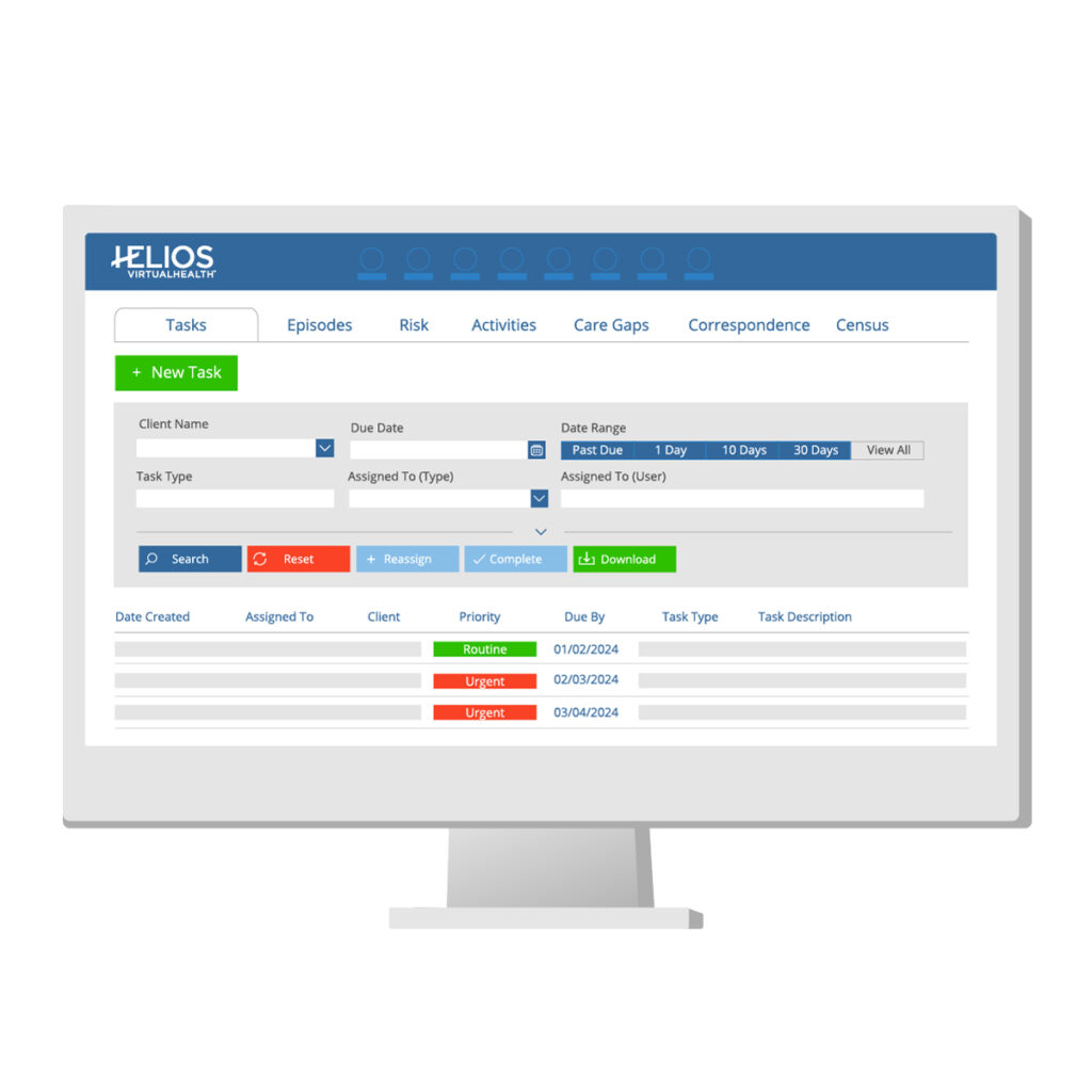
What Does HELIOS UX Look Like?
As you can see a little bit above, HELIOS itself is designed to provide an intuitive user experience that makes it easy to use and supports significant gains in efficiency and productivity. You can see too that we employ some of the seven UX features we’ve called out.
In addition to the above seven UX features, HELIOS also offers a simple navigation menu and only takes 1-3 clicks to get to anywhere in the platform. Info boxes in the platform also work to provide quick information snippets or help tips.
Meanwhile, member views provide 360-degree client information, so any person who is part of a client’s care continuum will have access to the information they need (based on role-based access rules) and be able to make accurate and informed decisions based on real-time data. The platform is always updated, so any care lead across settings or the client’s case manager can operate with the same up-to-date information.
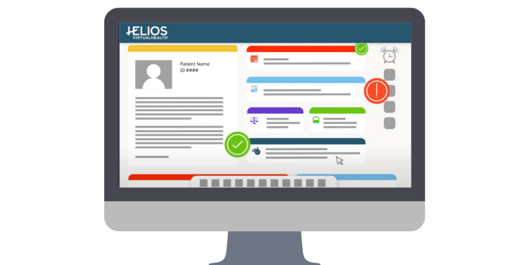
This allows HELIOS users to feel confident in a source-of-truth view and consider more facts beyond their immediate health that may impact care.
HELIOS UX was designed to drive collaborative care
The unique design of HELIOS blends user experiences for care managers, providers, administrators, patients, and caregivers/families. These user experiences deliver comprehensive functionality across CM, DM, UM, community resource coordination, telehealth, communication, collaboration, analytics, reporting, and numerous other tools. It is the most comprehensive and most intelligently assembled solution for value-based care across all major healthcare lines of business including Medicare, Medicaid, Dual Eligible, Commercial, LTSS, BH, and IDD.